
How to Pick a Paint Color Without Regretting It Later
Choosing paint should be simple.
It’s “just paint,” right?
And yet it’s one of the most stressful decisions homeowners make. You stare at 200 nearly identical whites. You test three grays. They all look wrong. One looks blue at night. Another looks beige in the morning. Suddenly you’re questioning everything.
Paint regret usually doesn’t happen because someone chose a terrible color.
It happens because they chose a color without understanding what influences it.
The good news is this: once you understand how paint actually behaves inside a home, the decision becomes much easier — and far more predictable.
Here’s how to choose a paint color the right way.
1. Start With What You Cannot Change
Before you look at a single swatch, stop and assess the room.
Paint should support your fixed elements — not fight them.
Look at:
Flooring (wood tone, tile, carpet)
Countertops
Cabinetry
Fireplace stone or brick
Large built-in features
Large furniture pieces that are staying
Every one of these has an undertone.
If your floors lean warm (honey oak, warm walnut, beige tile), pairing them with a cool gray wall often creates tension. It won’t feel cohesive — even if both colors look beautiful on their own.
This is where many mistakes happen. People pick paint in isolation.
Instead, hold paint samples directly against your flooring and cabinetry. If the undertones clash immediately, trust that instinct.
Paint is flexible. Stone and wood are not.
2. Understand Light Before You Choose Anything
Light changes everything. The same paint color can look completely different depending on exposure.
Here’s what to know:
North-Facing Rooms - Cool, indirect light. Colors appear flatter and slightly grayer. Warm tones help balance this.
South-Facing Rooms - Bright, warm light most of the day. Colors appear more saturated and sometimes brighter than expected.
East-Facing Rooms - Warm in the morning, cooler in the afternoon.
West-Facing Rooms - Neutral early in the day, warmer toward evening.
This is why that “perfect beige” looked amazing in the store and slightly green in your living room. If you’re unsure about exposure, spend one full day observing how light moves through the room. Morning, afternoon, evening. It’s worth the time.
3. Choose Undertone First, Color Second
Most people ask: “What white should I use?”
A better question is: “Do I want a warm white, neutral white, or cool white?”
Every paint color has an undertone — even if it’s subtle.
Grays may lean:
Blue
Green
Purple
Taupe
Whites may lean:
Creamy/yellow
Pink
Gray
Blue
If you ignore undertones, you risk creating tension between walls and fixed finishes.
When comparing samples, hold them next to each other. The undertones become obvious when side by side.
And always compare against your trim color. If your trim is a bright crisp white and your wall white is creamy, the contrast will highlight the difference.
Consistency feels intentional. Mismatch feels accidental..
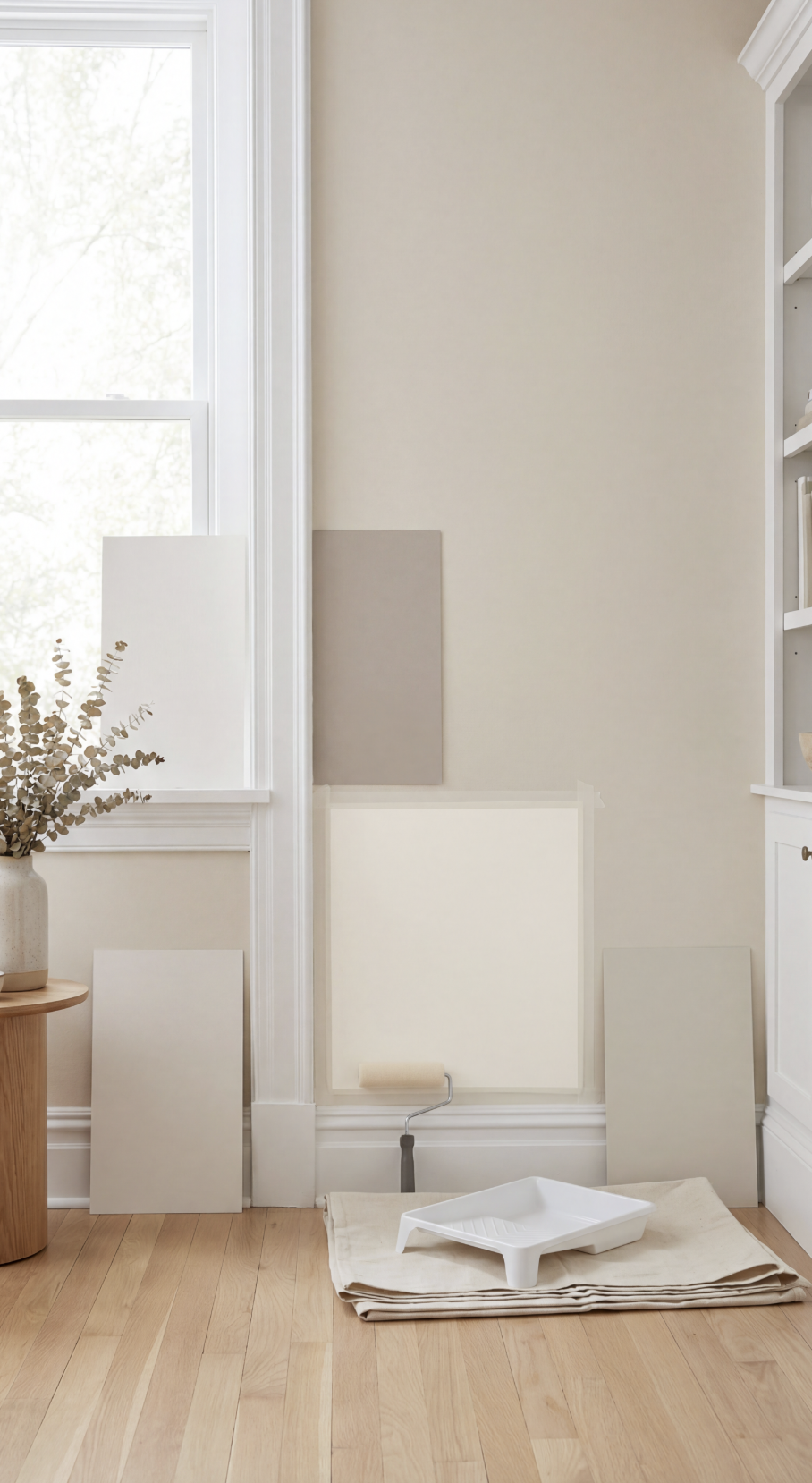
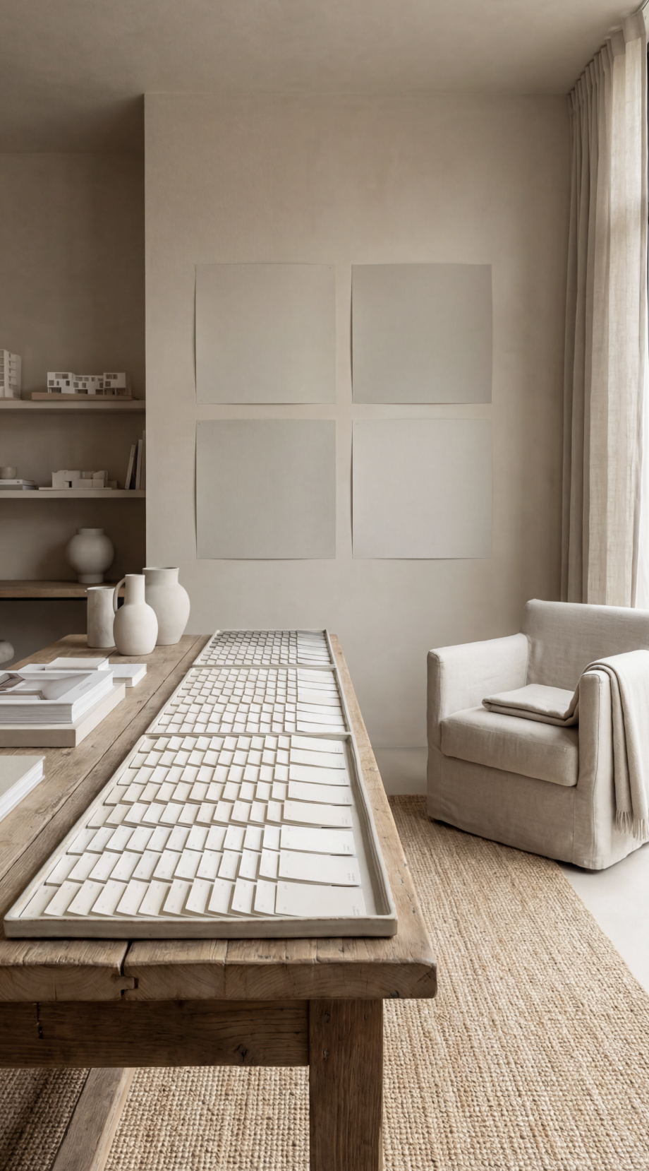
4. Test Paint the Right Way
Tiny paint swatches are misleading. Instead of painting small squares directly on your wall, use large peel-and-stick paint samples. Brands like Samplize allow you to order sizable samples that you can move around the room.
This matters because paint changes based on:
Lighting
Surrounding colors
Time of day
Angle of view
Move the sample:
Near the window
Across from the window
Next to trim
Beside cabinets
Near flooring
Look at it in morning light. Afternoon light. Evening light with lamps on. If you’re painting directly on the wall, use a small foam roller for smooth application and paint at least a 2’ x 2’ section. Two coats. Let it dry fully. Rushing this stage is the biggest cause of regret.
5. Think About Flow Between Rooms
Homes rarely function as isolated boxes anymore. Even if walls separate rooms, your eye still moves from space to space. Instead of choosing completely different colors everywhere, build a palette.
For example:
One core neutral for main living areas
Slightly deeper version of that color for a bedroom
Coordinating but softer tone for a hallway
Flow makes a home feel calm and intentional. Random contrast makes it feel choppy. If your home is open concept, keep transitions subtle. Extreme shifts in undertone stand out quickly.
6. Don’t Chase Trend Colors
Every few years, paint trends swing hard. Cool gray dominated for years. Then ultra-bright white. Now warmer beige and mushroom tones are trending again. If a color screams a specific era, it may feel dated faster.
Timeless paint colors are balanced. They’re not extreme. Not overly saturated, overly cool or overly yellow. They sit quietly in the background and allow furniture, texture, and lighting to do the work. Paint should support the room — not demand attention.
7. Pay Attention to Sheen
Color gets most of the attention, but sheen matters just as much.
Flat or matte:
Hides imperfections
Softens color
Feels modern
Less washable
Eggshell:
Slight durability
Subtle softness
Satin:
More washable
Slightly reflective
Semi-gloss:
Best for trim and doors
If your walls have imperfections, a matte finish can minimize flaws. If you have kids or high-traffic areas, eggshell or satin may make more sense. Consistency matters here too. Mixing sheens randomly can highlight unevenness.

8. Invest in the Right Tools
The painting process influences how the color looks. Cheap rollers leave texture inconsistencies. Low-quality brushes leave visible strokes.
Use:
High-density microfiber roller covers for smooth finishes
A quality angled sash brush for cutting in
Painter’s tape designed for clean removal (especially if you’re protecting fresh trim)
Proper prep matters too. Lightly sanding glossy walls and wiping them down before painting helps adhesion and reduces uneven absorption. Paint can only perform as well as the surface beneath it.
9. Sample in Context With Lighting
Before finalizing, test your paint under artificial lighting. Swap outdated bulbs for consistent soft white LED bulbs around 2700K. Mixed color temperatures in a room can distort paint appearance dramatically.
Warm light makes colors appear warmer.
Cool light makes them appear flatter and grayer.
If you’re changing paint, consider upgrading lighting simultaneously. The two work together. Good lighting supports good color.
10. The Safest Paint Strategy
If you’re overwhelmed, here is a low-risk formula:
Choose a soft, warm neutral that complements your flooring.
Keep trim a consistent clean white throughout the house.
Add personality through texture, art, and furniture — not bold wall color.
Paint is expensive to redo. Pillows are not.
Walls set the tone.
Decor sets the personality.
Final Thought
Paint regret usually isn’t about choosing the “wrong” color. It’s about choosing too quickly.
When you:
Study your fixed finishes
Understand undertones
Observe lighting
Test properly
Think about flow
You remove most of the guesswork. And instead of repainting in two years, you end up with walls that quietly support your home for a long time.
Because the best paint color isn’t the one that looks exciting on a swatch. It’s the one that still feels right after you’ve lived with it.